Examples
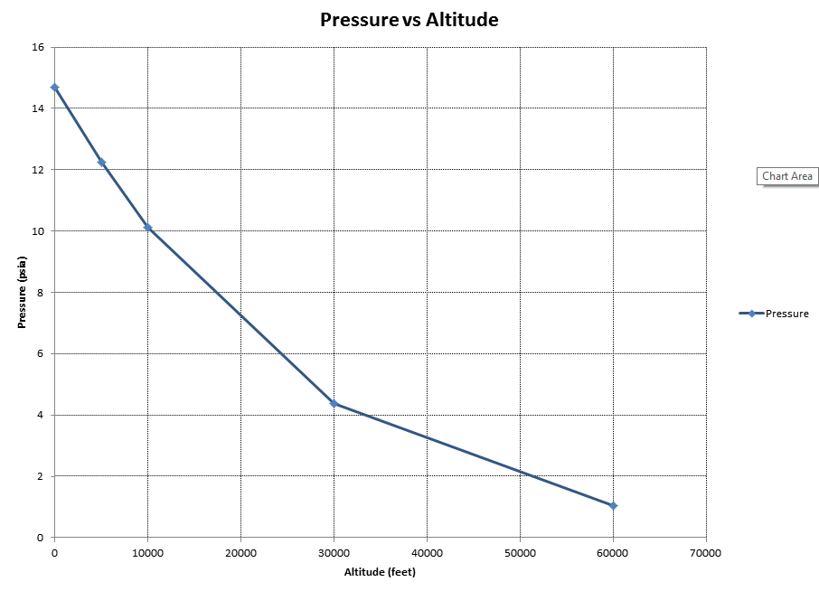
Altitude vs Pressure
This is a simple scatter plot of a standard atmospheric pressure vs altitude.
Click images to see full size
The python code below generates the plot shown above. The basic approach is to create
a list_of_rows containing the data labels, units and values. Make a data sheet with
the add_sheet command. Create a scatter plot with the add_scatter command. And finally,
save as an ods file with the save command.
The list_of_rows input variable has the following format.
Row 1 holds all of the labels of each column
Row 2 holds the units for each column (use ‘’ for no units)
Rows 3 through N hold data values.
After saving, the spreadsheet can be launched with the launch_application command and either
Excel, LibreOffice or OpenOffice will open depending on which is linked to ods files on your system. (Note that the
save command also has a launch=True option, shown in the next example.)
from odscharts.spreadsheet import SpreadSheet

mySprSht = SpreadSheet()

list_of_rows = [['Altitude','Pressure'], ['feet','psia'],
                [0, 14.7],    [5000, 12.23], [10000, 10.11],
                [30000, 4.36],[60000, 1.04]]

mySprSht.add_sheet('Alt_Data', list_of_rows)

mySprSht.add_scatter( 'Alt_P_Plot', 'Alt_Data',
                          title='Pressure vs Altitude',
                          xlabel='Altitude',
                          ylabel='Pressure',
                          xcol=1,
                          ycolL=[2])
mySprSht.save( filename='alt_vs_press' )

mySprSht.launch_application()
Trig Functions
The trig function example builds a large list_of_rows variable to display sine and cosine functions.
See Running ODSCharts on the QuickStart page for further details of the Trig Function example.
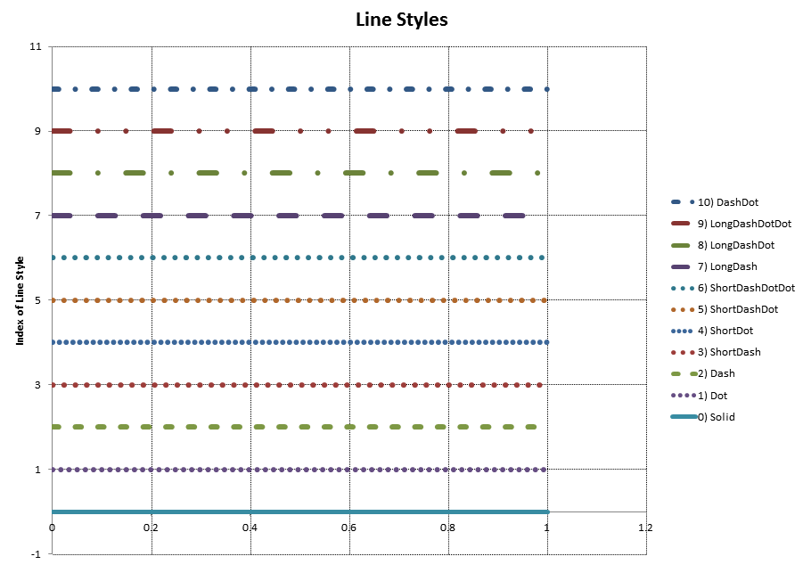
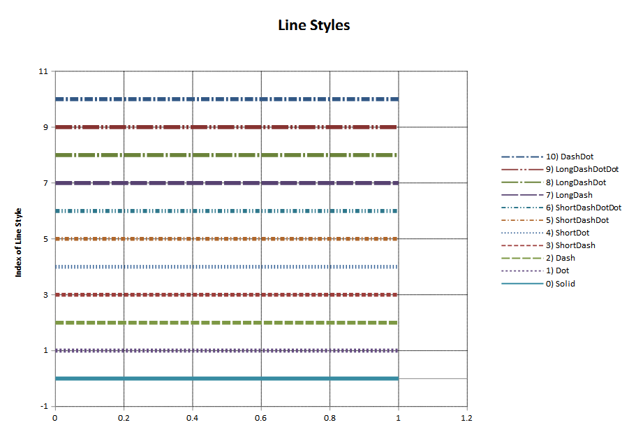
Line Styles
There are 10 dashed line styles in ODSCharts. This example shows them all.
Notice that OpenOffice renders the various line styles more distinctly than Excel. (i.e. A number of the styles are hard to distinguish from one another in Excel.)
| Excel Output | OpenOffice Output |
|---|---|
|
|
Click images to see full size
The python code below generates the plots shown above.
"""
This example demonstrates the use of line styles
"""
from math import *
from odscharts.spreadsheet import SpreadSheet
from odscharts.line_styles import LINE_STYLE_LIST as sL

mySprSht = SpreadSheet()
rev_orderL = list( range(10,-1,-1) )

toprow = ['Line Style Index']
unitsrow = ['']
toprow.extend( ['%i) %s'%(i,sL[i]) for i in rev_orderL] )
unitsrow.extend( ['' for i in rev_orderL] )

xbegrow = [0]
xbegrow.extend( [i for i in rev_orderL] )
xendrow = [1]
xendrow.extend( [i for i in rev_orderL] )

list_of_rows = [toprow, unitsrow, xbegrow, xendrow]

mySprSht.add_sheet('Line_Style_Data', list_of_rows)

mySprSht.add_scatter( 'Line_Style', 'Line_Style_Data',
                      title='Line Styles',
                      xlabel='',
                      ylabel='Index of Line Style',
                      xcol=1,
                      ycolL=[2,3,4,5,6,7,8,9,10,11,12],
                      lineStyleL=[i for i in rev_orderL],
                      lineThkL = [1.5],
                      showMarkerL=[0])

mySprSht.setYrange( ymin=-1, ymax=None, plot_sheetname=None)
mySprSht.save( filename='line_style_plot', launch=True)
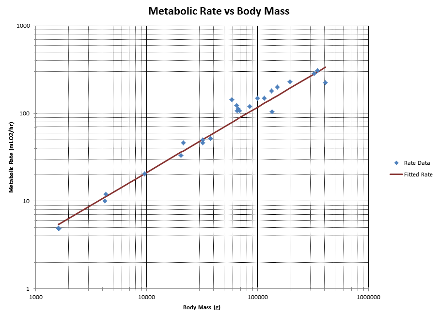
Metabolic Rate vs Body Mass
This example demonstrates log plots using body_mass vs metabolic_rate data taken from: http://www.datacarpentry.org/semester-biology/assignments/r-4/ (Data Carpentry for Biologists)
XY_Math was used to fit the data to a power curve.
See the XY_Math docs at: http://xymath.readthedocs.org/en/latest/.
It resulted in the following curve fit.:
Fitting Non-Linear Equation to dataset with Percent Error.

y = A*x**c
    A = 0.022110831039
    c = 0.745374452331
    x = Body Mass (g)
    y = Metabolic Rate (mLO2/hr)
    Correlation Coefficient = 0.935357443771
    Standard Deviation = 31.8545944339
    Percent Standard Deviation = 20.5192091584%
y = 0.022110831039*x**0.745374452331
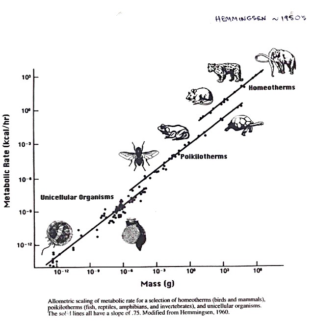
When I think of data that spans many orders of magnitude, I think of the historical plots of metabolic rate vs body mass (see plot lower right)
ODSCharts is used here to create a similar plot spanning a mere 3 orders of magnitude as compared to the 18 orders of magnitude in the historical plot.
Click images to see full size
The more interesting ODSCharts features used in this plot include
Adding a column of calculated values to the data
Setting the
logxandlogyflagsShowing markers-only for the data and line-only for the curve fit
The python code is shown below.
# Grams
body_mass = [32000, 37800, 347000, 4200, 196500, 100000, 4290,
    32000, 65000, 69125, 9600, 133300, 150000, 407000, 115000, 67000,
    325000, 21500, 58588, 65320, 85000, 135000, 20500, 1613, 1618]

# mLO2/hr
metabolic_rate = [49.984, 51.981, 306.770, 10.075, 230.073,
    148.949, 11.966, 46.414, 123.287, 106.663, 20.619, 180.150,
    200.830, 224.779, 148.940, 112.430, 286.847, 46.347, 142.863,
    106.670, 119.660, 104.150, 33.165, 4.900, 4.865]

dataL = []
for bm, mr in zip(body_mass, metabolic_rate):
    dataL.append( [bm,mr] )
dataL.sort()

# create a list of curve fit data
for row in dataL:
    bm, mr = row
    row.append( 0.022110831039*bm**0.745374452331 )

list_of_rows = [['Body Mass','Rate Data','Fitted Rate'], ['g','mLO2/hr','mLO2/hr']]
list_of_rows.extend( dataL )

mySprSht = SpreadSheet()
mySprSht.add_sheet('MassRate_Data', list_of_rows)

mySprSht.add_scatter( 'MassRate_Plot', 'MassRate_Data',
                          title='Metabolic Rate vs Body Mass',
                          xlabel='Body Mass',
                          ylabel='Metabolic Rate',
                          xcol=1, logx=1, logy=1,
                          showLineL=[0,1], showMarkerL=[1,0],
                          ycolL=[2,3])
mySprSht.setXrange(xmin=1000)
mySprSht.save( filename='mass_vs_rate', launch=True )
Body Mass Index (BMI)
This example takes some body mass index (BMI) data from the World Health Organizations’s (WHO) website http://knoema.com/WHOGDOBMIMay/who-global-database-on-body-mass-index-bmi and compares the percentage of the US and Australial population that have a body mass index in the normal, overweight and underweight categories.
What makes this chart interesting from an ODSCharts perspective is the combining of data
from different data sheet tabs within the spreadsheet onto the same chart.
A portion of the bmi_index.py example is shown below.
The first two lines create two tabbed sheets of data within the spreadsheet called “Aussie_Data” and “USA_Data”.
The call to
add_scattercreates a scatter plot called “Combo2_Plot” using the “Aussie_Data”.The call to
add_curveadds the “USA_Data” to “Combo2_Plot”.
Notice that on setting properties like showMarkerL or lineThkL that simply filling in the first
value will cause all three curves to use that first value. For example, lineStyleL=[1,] will
cause all of the curves to use Dot line styles.
mySprSht.add_sheet('Aussie_Data', aussieLL)
mySprSht.add_sheet('USA_Data', usaLL)
.
. <snip>
.

mySprSht.add_scatter( 'Combo2_Plot', 'Aussie_Data',
                       title='Australian and USA BMI', xlabel='Year',
                       ylabel='Percent of Aussie Population',
                       y2label='Percent of USA Population',
                       xcol=1,
                       ycolL=[2,3,4],
                       showMarkerL=[0,],
                       lineStyleL=[1,],
                       lineThkL=[2,],
                       colorL=['r','g','b'])

mySprSht.add_curve('Combo2_Plot', 'USA_Data',
                    xcol=1,
                    ycol2L=[2,3,4],
                    showMarker2L=[0,],
                    lineThk2L=[2,],
                    color2L=['r','g','b'])
| Excel Output | OpenOffice Output |
|---|---|
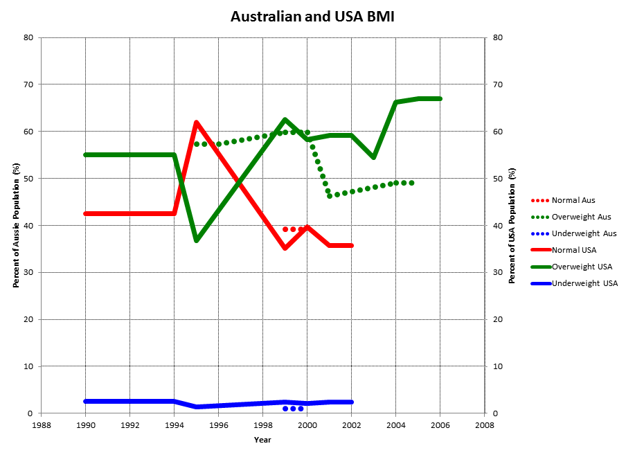
|
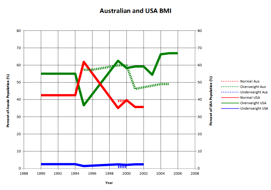
|
Click images to see full size